- Home | About
- • Personal Energy Stories •
- My Solar PV System
- The Refrigerator Story
- Lighting Choices
- Lessons from an Energy Meter
- Opt Out of Mail / Phonebooks / etc
- • Essays & Articles •
- Global Warming in a Nutshell
- Power and Energy in a Nutshell
- Why Move Beyond Fossil Fuels?
- • Local Programs •
- EnergySmart - Boulder County
- Longs Peak Energy Conservation
- Borrow an Energy Meter
- • Useful Links •
- TopTenUSA.org / Enervee.com
- DSIREusa.org
| 1. Carbon Dioxide (CO2) and Temperature Measurements |
| Direct CO2 Measurements 1958-2009 | CO2 and T from Ice Cores - 800,000 years |
|---|---|
 |
 |
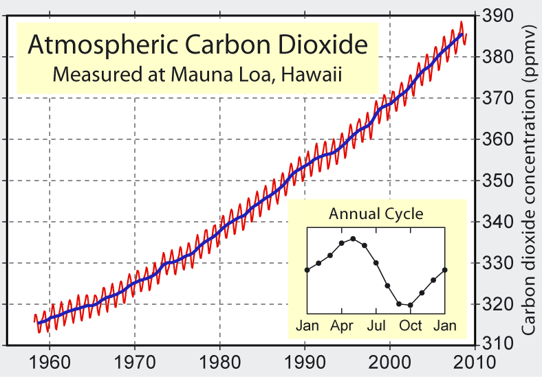
| This figure shows the concentration of atmospheric carbon dioxide measured at Mauna Loa, Hawaii from 1958 to 2009. The red curve shows monthly measurements of CO2 concentration in parts per million (ppm), and the blue curve is the annual average. The seasonal cycle is caused by respiration (breathing) by all of Earth's plants, and in the northern-hemisphere summer there is more plant activity taking in CO2 and reducing its concentration in the atmosphere. This graph is known as the Keeling curve, after Charles David Keeling who maintained this excellent record over the years. This is the first significant evidence of rapidly increasing CO2 levels in the atmosphere, and Keeling is often credited with first bringing to the world's attention the effect that human activity is having on the Earth's atmosphere and climate.
A higher CO2 concentration absorbs and traps more heat in the atmosphere, warming the planet. The atmospheric CO2 concentration prior to the industrial revolution was stable at about 280 ppm. It began rising as humans started burning massive amounts of coal and oil to power industrial civilization. By 1958 the CO2 concentration was 315 ppm and accelerating, and by 2010 it was 390 ppm, 39% higher than pre-industrial levels. The reason that deforestation is linked with global warming is that deforestation (fewer plants) leads to less removal of atmospheric CO2 by plant respiration, and therefore a higher CO2 concentration remains in the atmosphere. Figure created by Robert A. Rohde from published data for Global Warming Art. |
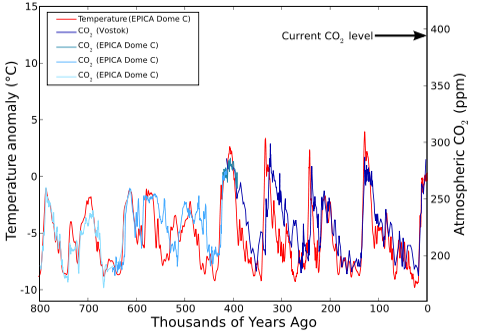
This is the long-term (800,000 year) record of atmospheric CO2 concentration (right scale) and reconstructed temperature (left scale) from analysis of Antarctic ice cores acquired by EPICA (European Project for Ice Coring in Antarctica). The temperature scale is the difference from the average temperature over the last 100 years, so it is degrees difference from modern times. Over the last few hundred thousand years there has been a sequence of alternating glacial ages (mini ice ages) and "inter-glacial warm periods" (we've been in one for about 11,000 years). The data show that a glacial age corresponds to a global temperature that is lower than today's by 7-8°C (12-14°F).
The good correlation between CO2 concentration and temperature strongly supports the link that is predicted from basic global warming theory. On the timescale of this figure, the last few thousand years are squashed up against the right axis, where the CO2 concentration has been 270-280 ppm. The arrow shows the current CO2 level of 390 ppm that has occurred in only the last century, much faster and higher than anytime in the last 800,000 years. The atmosphere has begun to respond to the increased CO2 level with a temperature increase of about 0.6°C in the last century, and the figure gives no reason to doubt continued warming in response to the unprecedented increase in CO2. We are now beginning a grand experiment to see what happens to the planet when we increase the temperature. Figure created by Leland McInnes from published EPICA data. |